Description
As a graphic designer, you start noticing a pattern after some time.
Most geometric sans-serif fonts look clean… but also kind of boring. Too safe. Too predictable.
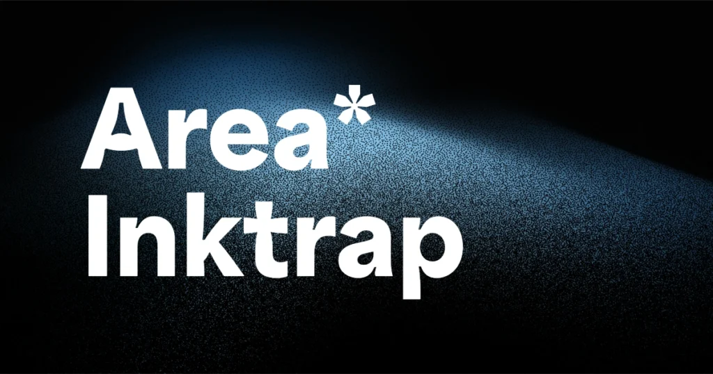
Area Inktrap sits in a different space.
It’s a modern geometric font that looks professional at first glance, but once you zoom in, you’ll notice subtle inktrap cuts that give it personality. These small details are what make the font feel designed, not just generated.
If you work on branding, posters, websites, or typography-led layouts, Area Inktrap is the kind of font that quietly upgrades your work.
What Is Area Inktrap Font?
Area Inktrap is part of the Area font family, created by the type foundry Blaze Type.
The Inktrap version includes intentional cut-ins at letter joints. Originally, inktraps were used to prevent ink bleeding in print, but in modern typography they’ve become a design choice — adding texture and sharpness to letterforms.
What makes Area Inktrap different from many experimental inktrap fonts is balance.
It doesn’t feel decorative or overdone. You can actually use it in real client projects without worrying about readability.
Why Area Inktrap Works So Well for Graphic Designers
From real design use, here’s why this font stands out:
- Geometric sans-serif base – clean, modern, and structured
- Subtle inktrap details – visible, but not distracting
- Wide range of weights – perfect for hierarchy and layout systems
- Works in print and digital – posters, websites, brand assets
- Still readable at small sizes – rare for inktrap fonts
This makes Area Inktrap suitable not just for headlines, but also for supporting text in design systems.
Best Use Cases for Area Inktrap Font
Brand Identity & Logo Design: Area Inktrap is a great choice when you want a modern brand look that doesn’t feel generic. The inktrap details help logos stand out without forcing anything.
Posters & Editorial Design: In large sizes, the font really shines. The cuts become more noticeable and give your typography a sharp, confident look.
Web Design & UI Typography: Thanks to its clean spacing and consistent shapes, Area Inktrap works well in web layouts, landing pages, and hero sections — especially when paired with a simple body font.
Font Pairing Tips (From a Designer’s Perspective)
Area Inktrap already has character, so pairing it smartly matters.
- Use a neutral sans-serif for body text
- Or pair it with a classic serif to create contrast
- Avoid pairing it with another “busy” display font
Let Area Inktrap handle headlines, logos, or key sections.
Area Inktrap Font Free Download & License
Area Inktrap is available on Adobe Fonts, so if you have an Adobe Creative Cloud subscription, you can use it for free. It’s allowed for both personal and commercial projects, which makes it safe for client work.
Final Thoughts (Honest Designer Take)
Area Inktrap is not a flashy font — and that’s its biggest strength.
It’s clean, modern, and carefully detailed. The kind of geometric font you reach for when you want your typography to feel intentional, professional, and slightly different from the usual choices.
If you’re building brand identities, posters, or modern web layouts and want a reliable inktrap font, Area Inktrap deserves a spot in your font library.