Tomato Grotesk Font Overview
Most grotesque fonts today feel… fine. They work, they’re clean, and that’s about it. Tomato Grotesk was interesting to me because it didn’t feel like another “safe” choice. It’s clearly modern, clearly structured, but it doesn’t disappear once you start using it.
It has that Swiss-style backbone, but there’s something slightly softer going on. Not playful in an obvious way. Just enough personality to keep things from feeling flat. I’d easily put it in the category of fonts that feel premium without trying too hard.
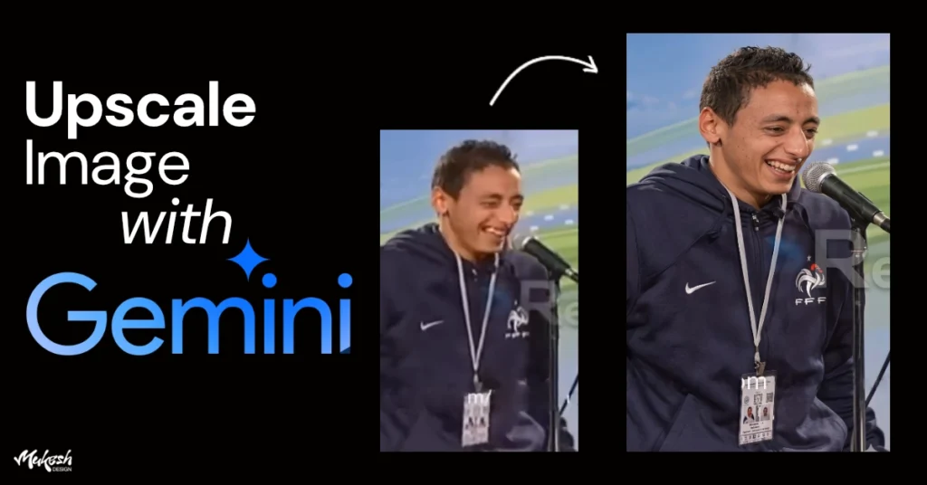
Upscale Low Quality Image in Google Gemini for FREE [Prompt]
Ever had a photo that you really needed... but the quality... Read more
The Story Behind Tomato Grotesk Typeface Design
The backstory is simple and a bit unexpected. Andrea Biggio designed Tomato Grotesk after noticing a tomato illustration on a pizza box. A sliced tomato, seeds and all.
That sounds random, but when you look at the typeface, it makes sense. There’s geometry, but it’s not rigid. Curves feel intentional, not mechanical. The font feels designed, not engineered — and that’s a big difference if you work with type a lot.
Tomato Grotesk Font Family, Weights, and Styles
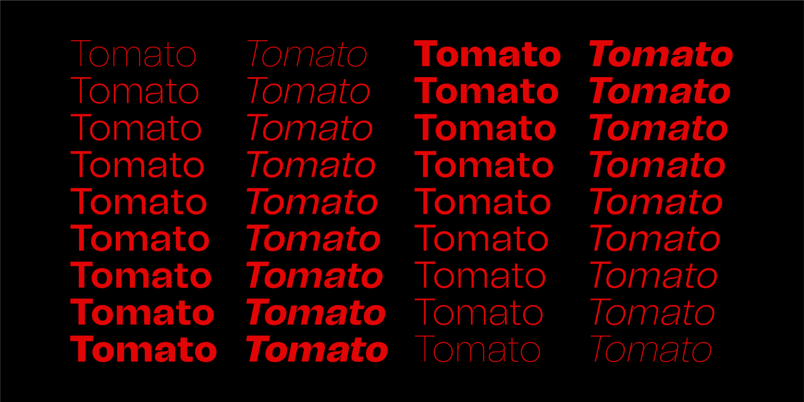
Tomato Grotesk comes as a large family: 18 styles across 9 weights, from Extra Light all the way to Black. Practically speaking, this means you can run an entire project on this one font if you want to.
The details are subtle, but they matter. Letterforms are slightly tight. Contrast is controlled. Some characters — especially the g and t — don’t look generic, which is honestly rare in grotesque fonts now. Nothing screams for attention, but nothing feels lazy either.
Where it works best (from real use)
In branding work, the heavier weights feel confident and clean. They sit well in logos and headlines without feeling bulky.
For web and UI design, Tomato Grotesk behaves nicely. It reads well on screens, even when sizes change. I’ve seen it work on landing pages, SaaS layouts, and simple dashboards without issues.
What surprised me a bit was the lighter weights. They’re usable for longer text. Not dramatic, not decorative — just calm and readable. For print or editorial-style layouts, that’s a big plus.
And yes, it also works on social media. Bold styles stay readable on small screens, which matters more than people admit.
Tomato Grotesk Font Free Download
If you’ve landed here looking for a Tomato Grotesk font family free download, you’re probably just trying to test the font before committing, which is fair. Tomato Grotesk is a premium typeface, so the full font family isn’t available for free use. That said, you can usually find a free demo or trial version from the official website.
The free version is enough to get a real feel for the font. You can drop it into branding mockups, try it in a UI layout, or see how it looks in social media designs before making a decision. Just keep in mind that for commercial projects, client work, or long-term use, you’ll need to buy the proper license. That’s when you unlock the full family, all weights, and can use it without worrying about usage restrictions.
Final take
Tomato Grotesk isn’t trying to reinvent grotesque typography. And that’s probably why it works. It’s structured, modern, and quietly confident.
If you’re tired of overused sans-serifs but don’t want to gamble on something too experimental, this font sits in a very comfortable middle ground. It’s one of those typefaces you don’t notice at first — and then keep using.