If you’ve ever opened a wedding card and thought, “Wow… this looks gorgeous!”, chances are, it wasn’t just the flowers, gold foil, or paper.
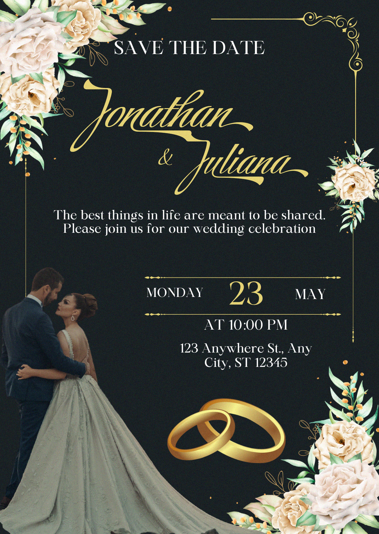
It was the font.
Fonts set the tone for your big day before the guest even reads a single word.
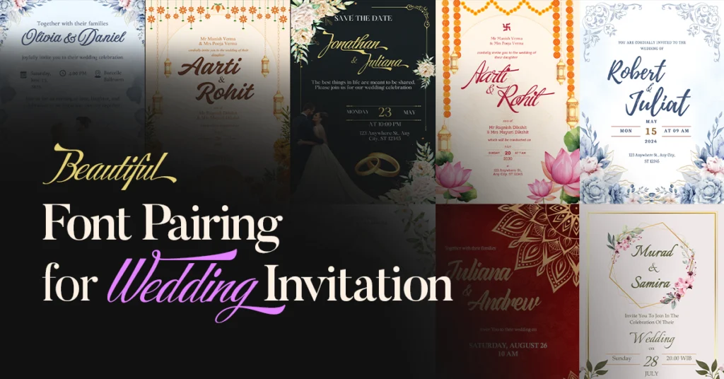
After designing 20+ wedding invitations… I’ve discovered something important: the right font combination sets a romantic tone and it helps you choose fonts for wedding invitations that feel personal and timeless.
In 2025, you’re not stuck with boring, overused wedding fonts. I’ve tested and curated the 10 best font pairings for wedding invitations that work beautifully for different wedding themes, plus I’ve also designed 10 sample wedding invitations so you can see exactly how I use these pairings in my work.
Why Font Choice Matters in Your Wedding Invite
A wedding card isn’t just for telling people the date and venue. It’s the very first impression of your big day.
The moment someone sees your invite, the font already tells them:
- Is the wedding formal or casual?
- Is the theme modern, classic, or a bit rustic?
- How much love and attention you’ve put into the details
Pick the right font and your invite feels elegant.
Pick the wrong one and… well, let’s just say it’ll give “Word doc from 2005” vibes 😅
💡Pro Tip: Always pair your main decorative font with a clean serif or sans serif for details. It keeps the design beautiful and easy to read.
Quick Handwritten & Script Font Pairing Cheat Sheet for Wedding Invitations
Need the perfect combo right now? Here’s your instant reference guide:
| Script / Handwritten Font | Pairing Font | Vibe |
|---|---|---|
| Praise | XB Yas | Elegant & Cultural |
| Russkopis | 29LT Riwaya | Cultural Heritage |
| Amoresa Aged | Kelvinch | Aged Elegance |
| Fineday | Times New Roman | Simple & Timeless |
| Playlist Script | Caladea | Relaxed & Readable |
| Buffet Script | Monradok | Confident & Strong |
| Italianno | Palatino / Garamond | Old World Charm |
| Hot Salsa | Calisto MT | Vibrant Energy |
| Script MT Bold | Quicksand | Modern & Clean |
| Storefront Pro | Maharlika | Luxurious Elegance |
The table gives you a quick idea of which fonts work well together, but seeing them in real wedding invitations makes all the difference. That’s exactly what I’ve shared below.
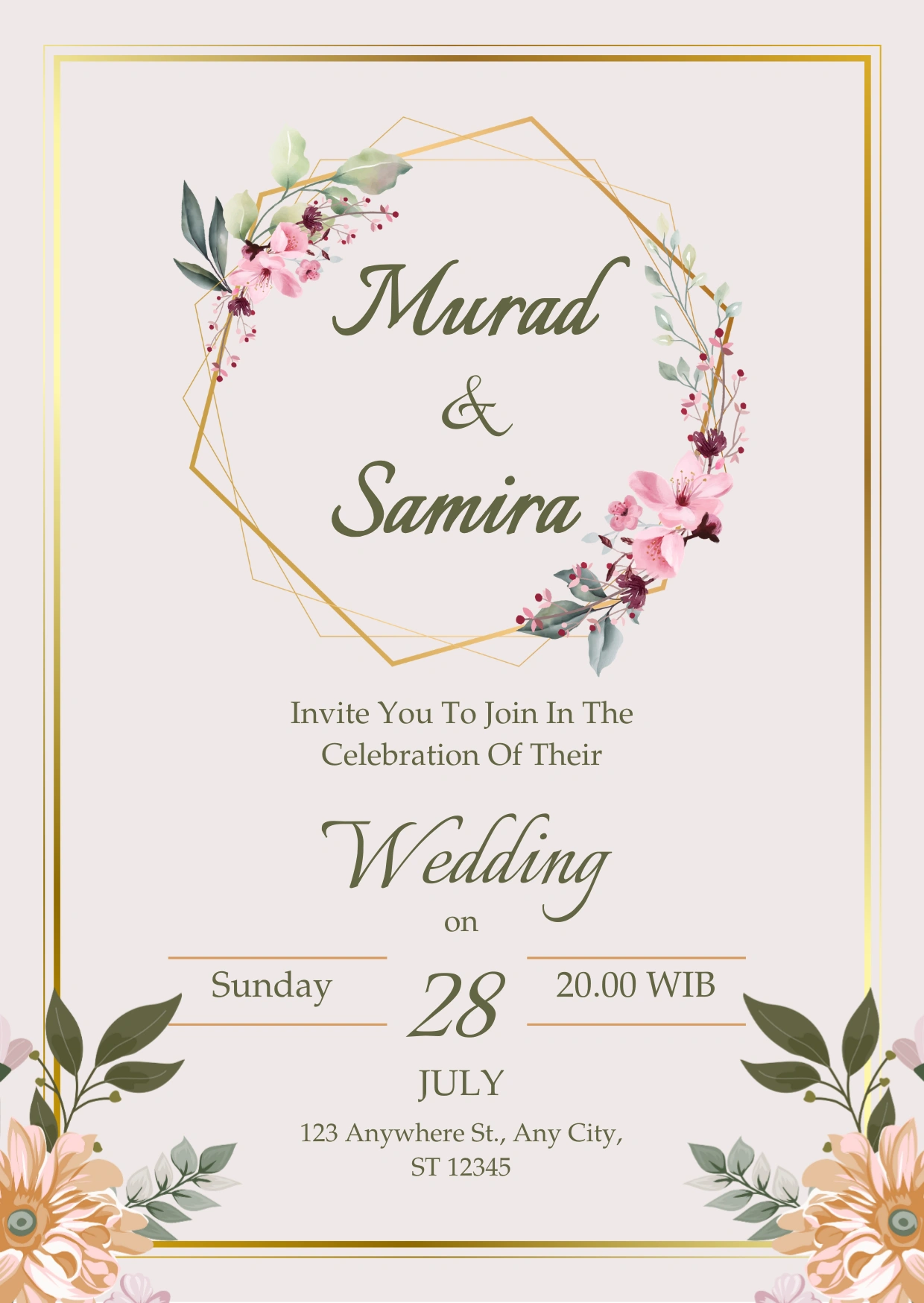
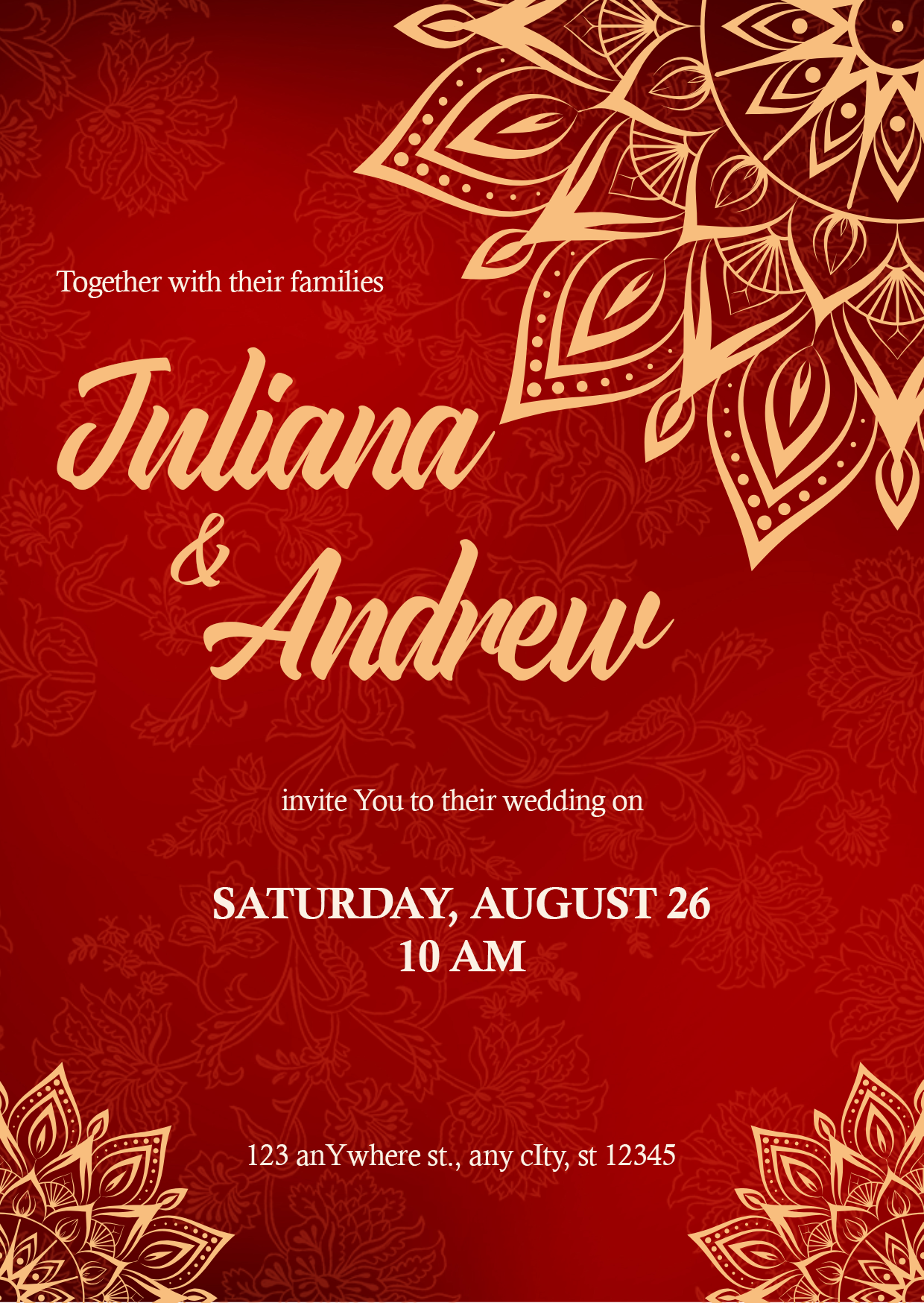
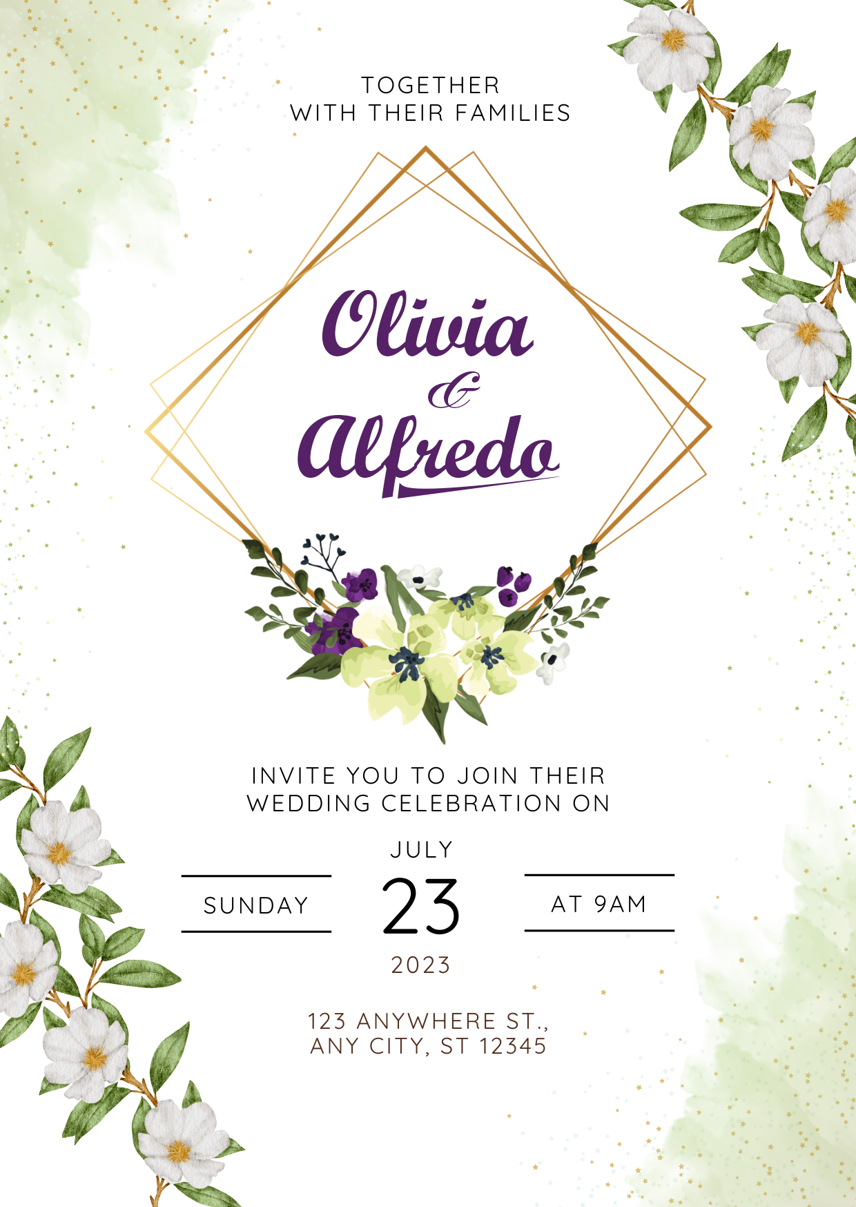
10 Script & Handwritten Font Pairings for Wedding Invitations You’ll Love
So, let’s look at some of the best font pairings for wedding invitations in 2025. Whether you’re planning a grand church wedding or a simple outdoor celebration, these combinations balance elegance and personality to match every style.
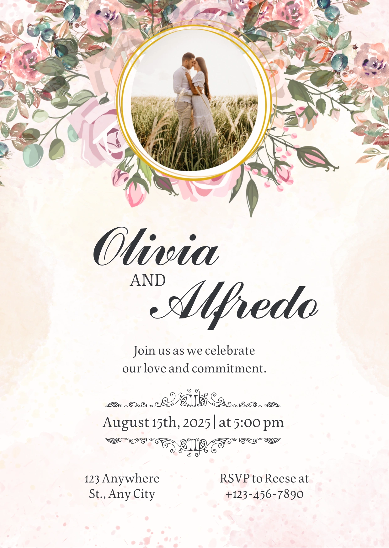
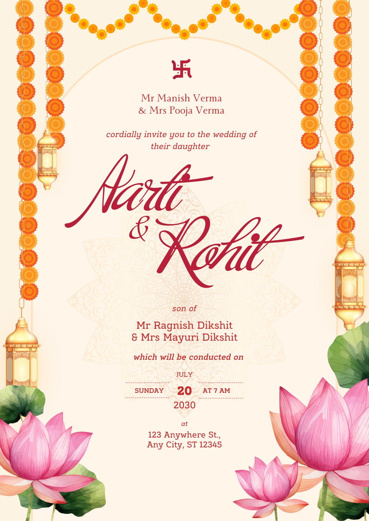
1. Praise + XB Yas
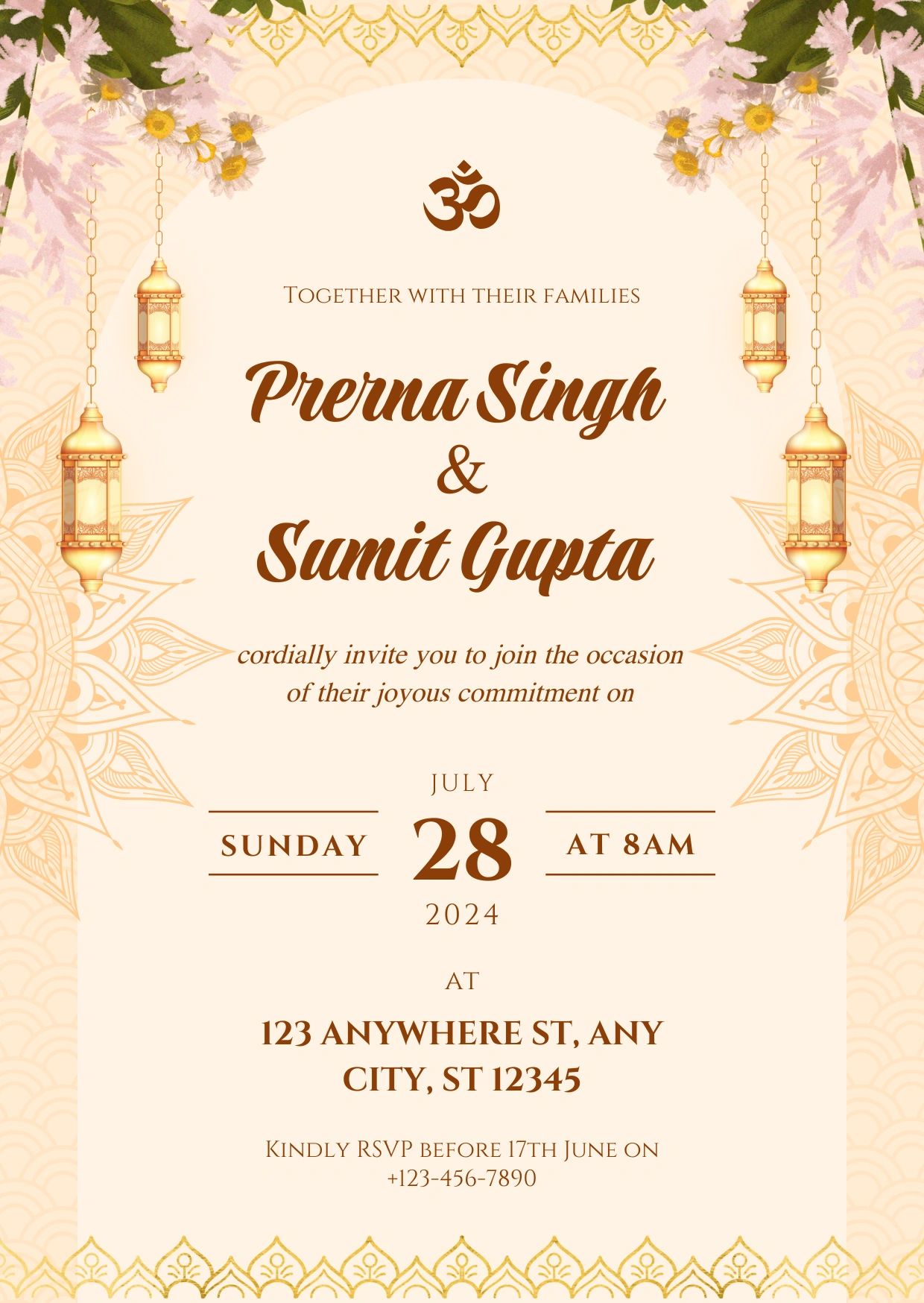
Font Pairing Tip: Use a decorative script like Praise for couple names to create a focal point, paired with a clean serif like XB Yas for easy readability in event details.
2. Russkopis + 29LT Riwaya
Font Pairing Tip: Use Russkopis for the couple’s names to draw attention, while keeping 29LT Riwaya for all secondary text like date, venue, and RSVP. This balance ensures your design feels artistic yet remains perfectly readable in print.
3. Amoresa Aged + Kelvinch
Font Pairing Tips: Pair a flowing script like Amoresa Aged with a classic serif such as Kelvinch to balance elegance with readability—perfect for wedding stationery that feels both romantic and refined.
4. Fineday + Times New Roman
Font Pairing Tips: Use Fineday for the main highlight and Times New Roman for the details. This keeps your design beautiful without losing readability.
5. Playlist Script + Caladea
Font Pairing Tip: Playlist Script shines best on names or short phrases. Balance it with a clean serif like Caladea so the invite feels elegant without losing clarity.
6. Buffet Script + Monradok
Font Pairing Tip: If your main font is bold and full of character, like Buffet Script, let the second font breathe. A clean serif like Monradok balances the energy, so your invite feels rich without getting too heavy.
7. Italianno + Palatino
Font Pairing Tip: Use a graceful script like Italianno for names or highlights to make them feel special. Pair it with a classic serif like Palatino, or Garamond for a softer vibe, to keep the rest of the text readable and refined.
8. Hot Salsa + Calisto MT
Font Pairing Tip: Use a stylish script like Hot Salsa for the names, then balance it with a classic serif such as Calisto MT for the body text. It keeps the invite elegant without overdoing it.
9. Script MT Bold + Quicksand
Font Pairing Tip: Pair a bold script like Script MT Bold with a clean sans-serif, such as Quicksand or even a classic serif.
10. Storefront Pro + Maharlika
Font Pairing Tip: Use a bold, stylish script like Storefront Pro to give names a dramatic spotlight. Balance it with a timeless serif font, such as Maharlika, to keep the rest of the text formal and easy to read.
Which Wedding Font Style Is Right for Your Wedding Invitations?
Confused by all the font pairing options? Let me make it simple.
- Traditional weddings = elegant scripts with clean serifs.
- Modern celebrations = minimal scripts with sans-serif support.
- Cultural ceremonies = fonts that honor your heritage.
- Outdoor/casual = handwritten vibes with readable pairs.
Pick your celebration style first, then choose fonts that support that energy.
My Simple Method for Matching Fonts to Wedding Themes
After designing countless invitations, I’ve cracked the code on font-to-theme matching.
Here’s my foolproof method: Look at your venue photos, then ask, “Does this feel formal or casual? Traditional or modern? Bold or subtle?” Your font combo should answer the same way. It’s that simple.
Quick Tips Before You Decide
- Stick to 2–3 fonts max on your invite
- Test print before finalizing (some scripts look thinner on paper)
- Keep readability in mind; tiny details can get lost in print
- Pair script & handwritten for names with serif/sans serif for details

Want to try the best font pairing for wedding invitations yourself? Good luck! Download my full wedding font list. Start experimenting with beautiful font combinations for your wedding invites today.
Frequently Asked Questions on Wedding Invitation Font Pairing
In 2025, couples are leaning towards elegant handwritten scripts like Bethoughter, Amalina, and Alex Brush for names, paired with timeless classics like Garamond, Palatino, or Quicksand for the details. These combos give a romantic yet easy-to-read vibe.
Pick one script or handwritten font for the couple’s names (that’s your “wow” factor) and pair it with a simple serif or sans-serif for the body text. This keeps the invite romantic but still clear and readable for your guests.
Yes, if you download from trusted sources. Free fonts like Alex Brush or Great Vibes look amazing and are often used in real wedding stationery. Just make sure the font license allows personal or commercial use, depending on your printer.