As a graphic designer, I still actively use Bento Grid Layouts in my design workflow. Whether I’m showcasing a single logo or designing a full brand identity, bento grid layouts help me keep everything clean and visually balanced. They make it easy to organize elements like logos, color palettes, mockups, and typography without feeling cluttered.
In this bento grid collection blog, I’m sharing some of the most creative and practical bento grid design examples I’ve found — and how I use them in my own design process.
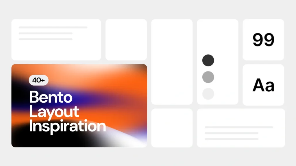
I didn’t create these layouts myself, but over time, I’ve collected 40+ bento grid examples that I keep coming back to for inspiration.
What Is a Bento Layout in Graphic & Web Design?
If you’re searching for Bento Grid Design Inspiration, it helps to first understand what this layout style actually means.
Think of a bento grid like a visual lunchbox; each “tile” or block holds one type of content, neatly separated but still part of the same overall layout. It’s a modular system inspired by Japanese bento boxes, and it has become extremely popular in UI design, website layouts, and visual storytelling.

You’ve probably seen it on sites like Apple, Notion, or Framer. But beyond web design, this style is slowly becoming a favorite among graphic designers, too.
How Bento Grid Layouts Help Me Showcase Full Brand Identity Projects
As someone who often works on brand identity projects, I’ve found that bento grids make it easier to show different pieces of a brand without overwhelming the viewer.
For example:
- I use one block to showcase the main logo.
- Another block for logo variations or icon versions.
- One for the color palette.
- One for font choices.
- And a couple for mockup previews.
This way, I can present a logo project in a single clean layout.

20+ Bento Box Layout Inspiration for Graphic Design
If you’re looking for Bento Box Design Inspiration for your next logo project, branding presentation, or Instagram carousel, these bento-style examples are worth bookmarking.
Below are some hand-picked examples I personally refer to. Each one plays with structure, negative space, and color in a way that feels modern yet timeless.


20+ Bento Grid Layout Inspiration for Web Design
Here’s a curated list of real-world websites that use a bento box layout from portfolios to product pages.
While exploring modern portfolio sites or even landing pages for layout ideas, I started noticing a pattern: a lot of them are using bento-style grids. Not just on Behance or Dribbble, but on real, published websites.
So I started saving the ones that stood out.
In this section, I’m sharing 20+ actual live websites that use bento grid layouts. You’ll find a mix of portfolio sites and landing pages, and product page websites.
I’ll also try to include source links wherever possible so you can experience the layouts and see how they handle things like managing layout & responsiveness in creative ways.
Apple’s Siri page uses a clean bento grid layout to break down voice command features into visual cards, making it easy to scan and explore.

DJI presents the Mini 4 Pro using a modern bento grid layout, combining product highlights, features, and video in neatly separated blocks.

This designer portfolio leverages a minimalist bento-style layout to showcase projects and capabilities in a highly visual, organized format.

Shortcut uses a functional bento grid layout to explain how teams can manage tasks and workflows, with clean card-based visuals.

The SaasPro website template utilizes a bento-style grid to promote SaaS features, benefits, and testimonials with strong visual hierarchy.

Buidle adopts a modern bento grid layout to present blockchain-focused dev tools, making technical content more approachable.
Alfread’s homepage features an animated bento grid that showcases the app’s reading experience with engaging, motion-rich visuals.

Saturation uses a visually balanced bento-style layout to curate design content in modular cards, perfect for easy exploration.

Sequence leverages a structured bento grid layout to introduce its AI-driven workflows, making complex ideas digestible.

Onyx showcases a stylish bento-style grid in Webflow, perfect for modern product storytelling with strong UI components.

Framer’s homepage itself is a strong example of a bento grid layout, showcasing features, templates, and use cases in a visual grid.

Dimension combines developer-focused branding with a clean bento grid layout that helps guide visitors through its feature set.

Supabase uses a modular bento layout to present its open-source backend tools with clear navigation and strong UX.

Highnote makes teamwork feel easy with a bento-style layout that breaks down its collaboration tools into simple, visual cards.

Gravitates uses a clean bento grid layout on its landing page to highlight product features like AI summaries, privacy-focused personalization, and content sharing.


Nucleum’s layout adopts a bento-style design, showcasing UI work and sections with strong whitespace and clean organization.

Cosmic demonstrates SaaS features using a grid-based bento layout that supports both desktop and mobile viewing elegantly.

Atomic’s site uses a bento-style layout tailored for Framer templates, combining clean cards and hover animations for interactivity.

BentoNow lives up to its name with a full-fledged bento grid layout that organizes product features and benefits with clarity.

Notion organizes its flexible workspace features into a bento-style layout that helps users explore templates, guides, and use cases visually.
How Designers & Brands Are Using Bento Grids Layout in 2025
- Personal Portfolio
If you want your work to speak for itself without a cluttered layout, bento grids are a no-brainer. They let you showcase each project like a card — clean, scroll-friendly, and super visual.
Zento Portfolio is a great example of personal portfolios that use bento grids to present work with elegance and structure.
- Landing Page/Product Page
Need to highlight features, CTAs, and testimonials without making people scroll forever? A bento-style layout helps break things up into chunks that actually make sense.
Apple Siri, SaaSPro, Buidl.so, and BentoNow are great examples of bento grid-based product landing pages that focus on clarity and conversion.
- Case Studies
Whether you’re explaining a product journey or showing off results, card-style layouts make it easy to guide people from point A to B without losing their attention.
Supabase, Notion and Shortcut are great examples of bento-style case study pages that flow like mini-presentations on the web.
Best Tools to Design Bento Grid Layouts (For Graphic & Web Designers)
There’s no single tool for bento-style layouts; it depends on what you’re designing. Graphic designers might use Illustrator or Photoshop, while beginners often choose Canva or Kittl.
UI/UX designers usually go with Figma, and some take it further using Framer, Webflow, or even custom CSS. So, it’s not about the tool, it’s about how you use it.
Wrapping It Up
So yeah, I’m pretty hooked on Bento Grid Design. They help me keep my designs clean without making them feel boring, and honestly, clients do notice the difference.
If you’ve been looking for real, practical Bento Grid Design Inspiration, I hope these examples spark some ideas for your next design.
Try using them in your next logo project, product showcase, or even a landing page. And if you’ve got any cool examples, feel free to DM me or drop them in the comments — I’m always up for seeing how other creatives are using this style!

My brother suggested I might like this web site. He used to be entirely right. This publish truly made my day. You can not believe simply how a lot time I had spent for this information! Thanks!
Woah! I’m really digging the template/theme of this website. It’s simple, yet effective. A lot of times it’s difficult to get that “perfect balance” between user friendliness and visual appeal. I must say you have done a fantastic job with this. Additionally, the blog loads super quick for me on Safari. Outstanding Blog!
Pingback: 16 Free Mockup Websites Designers Should Bookmark in 2025
It is appropriate time to make some plans for the longer term and it is time to be happy. I’ve read this post and if I could I desire to suggest you some interesting issues or advice. Perhaps you could write next articles referring to this article. I desire to read even more issues about it!
What’s up, after reading this awesome article i am as well glad to share my familiarity here with colleagues.