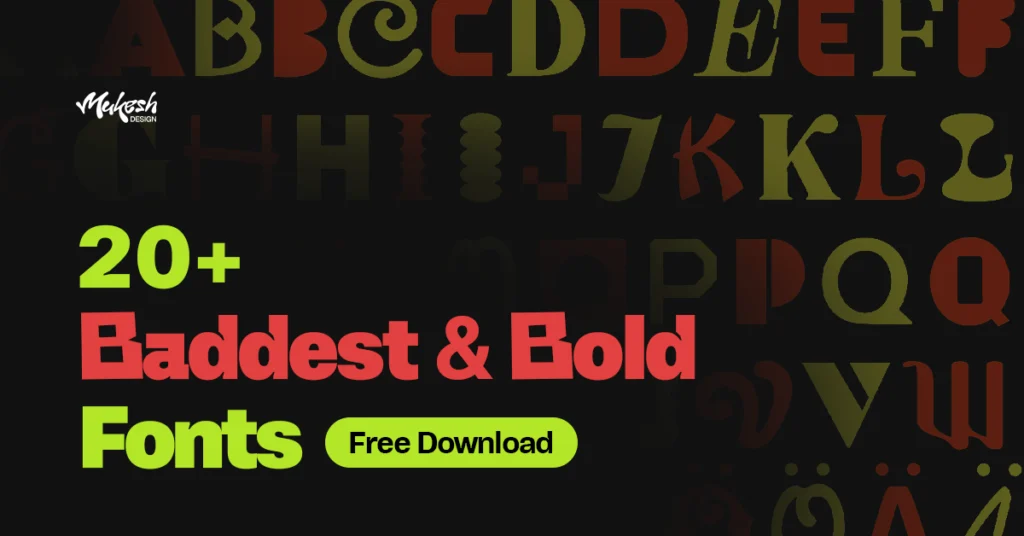
Looking for the baddestandbold fonts that make your design pop? You’re in the right place.
Whether you’re designing a poster, logo, YouTube thumbnail, or Instagram carousel post, bold font can change the whole vibe.
In this blog, I’ve listed some of the boldest and baddest fonts that I personally love using in my projects.
Most of them are paid fonts, and I’ve only shared the Bold or Black style. I’ve made things easier by giving you all the fonts in a single ZIP file. You’ll find the main download button at the very end of this blog.
So if you’re bored of regular fonts and want something with real impact, scroll down and explore this fresh list of bold & baddest fonts of 2025.
20+ Baddest & Bold Fonts – Handpicked Collection
Here’s my personal list of 20+ baddest & boldest fonts that look bold. I’ve tested each one while working on real design projects.
Some of these fonts have that clean, heavyweight look perfect for tech or fashion brands. Others bring more personality — edgy, retro, loud, or just straight-up badass.
It’s a solid mix of all-caps, display, grotesk, urban, and retro-style fonts and all handpicked by me.
My Criteria for Choosing the Baddest & Bold Fonts (Experience Insight)
Before we get into the list, here’s how I picked these fonts:
I tested them in real design tools like Photoshop and Illustrator
I looked for clean curves and well-balanced weight
I avoided generic-looking bold fonts — these are unique and memorable
1. Hagrid Heavy
Hagrid Heavy is thick, wide, and tight. Feels premium and loud. perfect for bold thumbnails, clean headers, or anything that needs a strong first look.
2. Mach Pro
Mach Pro has a bold, industrial feel that hits hard, making it ideal for impactful branding and attention-grabbing headlines.
3. Zuume Black
Zuume Black is bold, loud, and full of energy. Its tall, tight letters bring a serious attitude. great for posters, sports designs, or bold, modern graphics.
4. Vinila Black
Vinila Black appeals because of its boldness and geometric simplicity, giving it a modern feel. It’s well-suited for branding, clear communication, and impactful marketing visuals.
5. Worker Blacks
Worker Black has a rugged charm with sharp, angular cuts that convey strength and reliability. Its energetic style makes it perfect for industrial brands or sporty visuals.
6. NeueHaas Grotesk
Neue Haas Grotesk is bold, clean, and versatile. ideal for professional branding, modern UI, and clear headlines.
7. Comrade Bold
Comrade Black feels rugged and bold, great for strong headlines, posters, or designs needing a powerful impact.
8. Anzeigen Grotesk
Anzeigen Grotesk has a condensed form with tight spacing that gives it serious impact. It’s perfect for posters or banners where you want the text to punch through visually without needing decoration.
9. Roc Grotesk
Roc Grotesk grabs my attention with its rounded forms and strong visual weight. Its playful yet professional aesthetic makes it an excellent choice for modern branding, posters, and contemporary web designs.
10. Rothwood Ultra
Rothwood Ultra is attractive because of its robust, vintage-inspired design, blending old-school character. This makes it ideal for eye-catching headlines, signage, and retro-themed branding.
11. Ferryman Black
Ferryman Black feels handcrafted. The playful, uneven cuts give it personality and warmth, making it ideal for vintage-inspired branding or editorial headings.
12. Quatro UltraBlack
Quatro Black is a friendly yet bold character; it’s perfect for lively headlines or engaging advertising visuals. Its heavy, slightly rounded letters offer excellent readability while still packing a visual punch.
13. Mobley Sans Condensed
Mobley Bold feels robust and authoritative, with a solid, condensed look that works for bold statements, urban designs, or strong headlines.
14. Fractul Variable
Fractul Black is clean, structured, and bold, ideal for sleek branding or minimalist titles with modern flair.
15. Manometer Serif
Manometer blends vintage serifs with dynamic curves, perfect for unique logos or playful, retro-style posters.
16. Fit Wide
Fit Wide is a display beast. It’s made to dominate, great for music posters, album covers, or any place you want a typographic shout instead of a whisper.
17. Area Inktrap
Area Inktrap has bold cuts and funky edges. It’s perfect for eye-catching thumbnails, edgy logos, or anything that needs to look cool and different. (Speaking of thumbnails, here’s my free YouTube Thumbnail Downloader tool you might love.)
18. Humane Black
Humane Black is tall and tight, perfect for bold headlines, street-style posters, or any design that needs to shout without saying too much.
19. Cy Black
Cy Black has smooth curves and a techy feel. It’s clean, bold, and fits right into modern logos, posters, or anything that needs a sharp, confident vibe.
20. BigCity Grotesk
BigCity Grotesk is friendly and bold, perfect for modern brands, posters, or playful yet professional headlines.
21. Neulis Cursive Black
Neulis Black is fresh and bold with its rounded style. Its approachable yet energetic design makes it great for youthful branding, promotional materials, or modern packaging.
So, that was my collection of the baddest and boldest fonts — perfect for music posters, headlines, logos, and YouTube thumbnails. I’ve got more bold fonts lined up, and I’ll be dropping them in the next part of this series.
If you want the full font families of all these baddest & boldest fonts, DM me on Instagram.
Thoughts on Baddest & Bold font collection
These Bold fonts aren’t just heavy letters — they carry mood, vibe, and presence. Whether you’re designing for music, tech, fashion, or content creation, picking the right bold font can instantly level up your visuals.
All the fonts listed here belong to their respective creators and foundries. I’ve shared them for personal use and design inspiration only. If you plan to use any of them for commercial work, make sure to purchase the proper license from the official sources. Support the type designers — they make this magic possible!
Hi, I’m Mukesh — a graphic designer who loves creating. On this blog, I test AI tools and share practical tips, honest reviews, and design resources. I only recommend tools I’ve personally used and found genuinely useful in real creative workflows. Everything I share is tested, useful, and made to save your time as a creative.